To understand how the pandemic is evolving, it’s crucial to know how death rates from COVID-19 are affected by vaccination status. The death rate is a key metric that can accurately show us how effective vaccines are against severe forms of the disease. This may change over time when there are changes in the prevalence of COVID-19, and because of factors such as waning immunity, new strains of the virus, and the use of boosters.
On this page, we explain why it is essential to look at death rates by vaccination status rather than the absolute number of deaths among vaccinated and unvaccinated people.
We also visualize this mortality data for the United States, England, Switzerland, and Chile.
Ideally we would produce a global dataset that compiles this data for countries around the world, but we do not have the capacity to do this in our team. As a minimum, we list country-specific sources where you can find similar data for other countries, and we describe how an ideal dataset would be formatted.
Why we need to compare the rates of death between vaccinated and unvaccinated
During a pandemic, you might see headlines like “Half of those who died from the virus were vaccinated”.
It would be wrong to draw any conclusions about whether the vaccines are protecting people from the virus based on this headline. The headline is not providing enough information to draw any conclusions.
Let’s think through an example to see this.
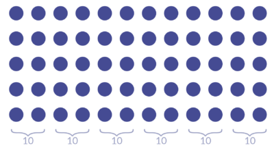
Imagine we live in a place with a population of 60 people.
Then we learn that 10 people died. And we learn that 50% of them were vaccinated.
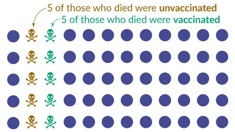
The newspaper may run the headline “Half of those who died from the virus were vaccinated”. But this headline does not tell us anything about whether the vaccine is protecting people or not.
To be able to say anything, we also need to know about those who did not die: how many people in this population were vaccinated? And how many were not vaccinated?
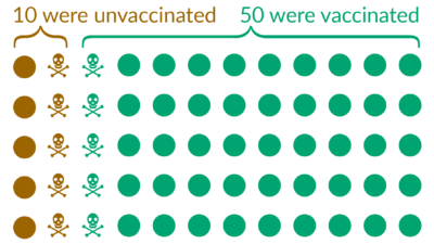
Now we have all the information we need and can calculate the death rates:
- of 10 unvaccinated people, 5 died → the death rate among the unvaccinated is 50%
- of 50 vaccinated people, 5 died → the death rate among the vaccinated is 10%
We therefore see that the death rate among the vaccinated is 5-times lower than among the unvaccinated.
In the example, we invented numbers to make it simple to calculate the death rates. But the same logic applies also in the current COVID-19 pandemic. Comparisons of the absolute numbers, as some headlines do, is making a mistake that’s known in statistics as a ‘base rate fallacy’: it ignores the fact that one group is much larger than the other. It is important to avoid this mistake, especially now, as in more and more countries the number of people who are vaccinated against COVID-19 is much larger than the number of people who are unvaccinated (see our vaccination data).
This example was illustrating how to think about these statistics in a hypothetical case. Below, you can find the real data for the situation in the COVID-19 pandemic now.
Data on COVID-19 mortality by vaccination status
Here we bring together the official mortality data by vaccination status published by the United States, England, Switzerland, and Chile. These charts are updated weekly, if new data has been published by the official source.
Switzerland has fully vaccinated 69.1% of its population, mostly with the mRNA vaccines produced by Pfizer and Moderna. Mortality data by vaccination status is published by the Federal Office of Public Health (data coverage also includes Liechtenstein).
This chart presents the COVID-19 death rate among unvaccinated people, among fully-vaccinated people, and among those who additionally received a booster dose.
You can click the “Change age group” button on the top left to explore data for a specific age group.
The mortality rate for the “All ages” group is age-standardized by Our World in Data, using single-year age estimates from the 2022 revision of the United Nations World Population Prospects for Switzerland. Rates for specific age groups are calculated as crude incidence rates.

The United States has fully vaccinated 67.8% of its population, mostly with the mRNA vaccines produced by Pfizer and Moderna. Mortality data by vaccination status is published by the US CDC.
This chart presents the COVID-19 death rate among unvaccinated people (0 doses received), people with a full primary vaccination series, those who received 1 booster dose, and those who received 2 booster doses.
You can click the “Change age group” button on the top left to explore data for a specific age group.
The mortality rate for the “All ages” group is age-standardized by the US CDC using the 2000 US Census standard population. Rates for specific age groups are calculated as crude incidence rates.
Archived: US COVID-19 weekly death rate by vaccination status, before boosters

Chile has fully vaccinated 90.7% of its population, mostly with the Sinovac vaccine. Mortality data by vaccination status is published by the Ministry of Health.
This chart presents the COVID-19 death rate among people who are not fully vaccinated, among fully-vaccinated people, and among those who additionally received a booster dose.
You can click the “Change age group” button on the top left to explore data for a specific age group.
The mortality rate for the “All ages” group is age-standardized by Our World in Data, using single-year age estimates from the 2022 revision of the United Nations World Population Prospects for Chile. Rates for specific age groups are calculated as crude incidence rates.


We’ve compiled here a list of links to similar datasets for many other countries. If you are aware of an official source of disaggregated data that is not listed here, please send us a message using the “Feedback” button on this page.
Our team at Our World in Data does not currently have the resources to bring this data together into a common global dataset. If others are interested in doing so, an ideal global dataset would pull this data together into a common format, making sure to harmonize the data in terms of methodology and denominator (for example, per 100,000 people), and would include complete documentation of the sources used. This would be a major contribution to public understanding of the pandemic.
| Location | Source | Data available by vaccination status |
| Australia | New South Wales Government | Cases in New South Wales |
| Chile | Ministry of Health | Cases + ICU admissions + deaths, by age group |
| Colombia | Esperanza Cohort, Ministry of Health and Social Protection, Colombia | Hospitalizations and deaths, by age group |
| England | Office for National Statistics | Deaths by age group |
| Finland | Department of Health and Welfare | Hospitalizations, by age group |
| France | Ministry of Solidarity and Health | Cases + hospital & ICU admissions + deaths |
| Germany | Robert Koch Institute | Hospitalizations + deaths |
| Israel | Ministry of Health | Deaths, by age (direct link to API) |
| Italy | Higher Institute of Health | Cases + hospital & ICU admissions + deaths Same data in machine-readable format maintained by MaxDevBlock |
| Liechtenstein | Federal Office of Public Health | Hospitalizations + deaths, by vaccine type |
| Malaysia | Ministry of Health | Cases, deaths |
| Northern Ireland | Department of Health | Hospitalizations + deaths |
| Singapore | Ministry of Health | ICU admissions, by age Deaths, by age |
| Slovenia | Government of Slovenia, via Sledilnik | Cases, hospital & ICU admissions |
| Spain | Ministry of Health | Cases + hospitalizations + deaths, by age group |
| Switzerland | Federal Office of Public Health | Hospitalizations + deaths, by vaccine type |
| United States | US CDC | Cases + deaths, by age group |