Notice: This is only a preliminary collection of relevant material
The data and research currently presented here is a preliminary collection or relevant material. We will further develop our work on this topic in the future (to cover it in the same detail as for example our entry on World Population Growth).
If you have expertise in this area and would like to contribute, apply here to join us as a researcher.
Interactive charts on Military Spending


These interactive data visualizations provide an overview of military expenditure across the world, in absolute terms, per capita terms and as a share of gross domestic product (GDP).
Military spending as share of GDP
This interactive chart shows each country’s military expenditure as a percentage of its gross domestic product (GDP).
Military spending is intimately linked to war. In times of peace, few countries spend more than 5% of GDP on their military, choosing instead to maintain their capabilities and make use of their armies in other ways.

Absolute military expenditure
This interactive map shows annual spending on military activities by country.
This is measured in constant 2019 US$, which adjusts for inflation over time.

Military expenditure per capita
This interactive chart shows annual spending on military activities, measured on a per capita basis.
This is measured in constant 2019 US$, which adjusts for inflation over time.

These interactive data visualizations provide an overview of military forces and personnel across the world, in total numbers, as a share of the population, and as a share of the labor force.
Total military personnel
This interactive chart shows the total number of people in the armed forces by country.
This includes those on active duty military personnel, as well as paramilitary forces if the training, organization, equipment, and control suggest they may be used to support or replace regular military forces.


Military personnel as a share of the population
This interactive chart shows the share of the total population in a country that are in the armed forces.
This includes those on active duty military personnel, as well as paramilitary forces if the training, organization, equipment, and control suggest they may be used to support or replace regular military forces.


Military personnel as a share of the labor force
This interactive chart shows the share of the labor force in a country that are in the armed forces.
This includes those on active duty military personnel, as well as paramilitary forces if the training, organization, equipment, and control suggest they may be used to support or replace regular military forces.

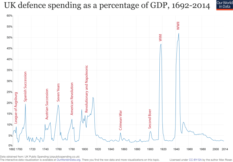
The extent to which war influences military spending is demonstrated in this visualisation.
The UK’s military spending as a percentage of GDP in peacetime fluctuates around 2.5%, in times of war however, military spending rises dramatically. At the height of the Second World War, the UK was spending around 53% of its GDP on its military. Such a dramatic rise is consistent with the existential danger faced by the UK during the Second World War.
- Data: National Material Capabilities (v4.0); military expenditure, personnel
- Geographical coverage: Global
- Time span: 1816 onwards
- Available at: http://cow.dss.ucdavis.edu/data-sets/national-material-capabilities
- Data: SIPRI Military Expenditure Database; “The SIPRI Military Expenditure Database contains consistent time series on the military spending of 171 countries since 1988, and of NATO member states from 1949 or from when they joined NATO. “
- Geographical coverage: Global by country
- Time span: 1949 onwards
- Available at: http://www.sipri.org/research/armaments/milex/milex_database
- Data: National accounts data
- Geographical coverage: Global by country
- Time span: Long time series with annual observations – from 19th century onwards
- Available at: Online here